Introducing Our SPY Line Chart Tool
December 08 2014 - 10:19AM
ETFDB
We recently rolled out a new feature on ETFdb that allows users
to get the best view of how the markets have behaved since the 2008
recession. The new tool, located here, displays a line chart
of the SPDR S&P 500 ETF (SPY)’s performance starting six months
before the market bottom. The tool allows users to compare SPY over
the years with a wide variety of other markets to see how
various economies and segments of the economy have progressed since
the financial crisis.
Users can compare SPY to commodities, bonds, major sectors, and
a multitude of countries from around the world. The chart makes it
easy to determine winners and losers for different stretches of
time and to see how the recovery has progressed across the
board.

Users can click on any of the buttons on the right-hand side of
the chart to compare SPY to a variety of ETFs representing all
corners of the market. The starting period is just before the crash
of Lehman and when the sell-off got particularly nasty – this
allows users to see both the dip and the recovery, rather than
starting at the bottom. At any point, users can hover-over the
chart for a more detailed look at the funds and their
performance:
 This
tool can give users a powerful, comparative look at the market
over the last few years and the current bull run.
Be sure to follow us on Twitter @ETFdb
Click here to read the original article on ETFdb.com.
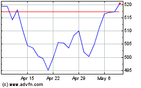
SPDR S&P 500 (AMEX:SPY)
Historical Stock Chart
From Mar 2024 to Apr 2024

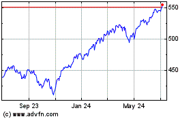
SPDR S&P 500 (AMEX:SPY)
Historical Stock Chart
From Apr 2023 to Apr 2024
